Designing Lutea Studios: Building a High-Fashion Brand Rooted in Somerset Craft and Editorial Storytelling
A Brand Born From Place, Craft, and Aesthetic Memory.
For years I’ve worked across creative direction, design, and brand-building, but Lutea Studios represents something different, a culmination of everything I’ve learned, shaped by Somerset’s landscape, its rhythms, and the quiet elegance of rural British life. It is a contemporary high-fashion brand that draws on nostalgia, craftsmanship, and editorial storytelling to create something refined, modern, and culturally grounded.
From the outset, my goal was simple but ambitious:
To build a British luxury fashion brand that could stand proudly alongside modern houses while staying deeply connected to its origins. This article is a behind-the-scenes look at how Lutea was designed, conceptually, visually, and philosophically, and how Somerset shaped the art direction, products, and storytelling. Throughout, you’ll find contextual links to parts of the brand’s ecosystem that further expand on the ideas behind Lutea.
The Philosophy: A Somerset Fashion Studio With Global Ambition
Lutea Studios began with an idea: To merge heritage materials with a contemporary editorial sensibility, creating something rooted but not nostalgic, restrained but not minimal.
Living and working in Somerset, I’m surrounded by: The visual textures of farmland
- Seasonal light changing across open fields
- Local craftspeople whose skills far exceed the often-romanticised idea of “rural making”
- This environment informed everything: material choices, brand values, visual direction, and even the tone of voice.
Lutea is a Somerset fashion studio not because it’s geographically located here, but because the values of the region, craft, slowness, pride in making, are embedded in the work.
Craft as the Foundation: Sustainable British Materials and Local Artisans
The studio’s commitment to sustainable British craftsmanship is not a marketing claim, it’s a production reality. Every product starts with:
- 100% British materials
- Fabric sourced from sustainable mills
- Local artisans hand-crafting each piece
- Early development of Lutea’s own wool, made in collaboration with local farmers
The emphasis on material provenance became a key differentiator in the early brand story. Rather than leaning on “cottagecore” fashion tropes, Lutea focuses on what is authentic, unromanticised, and real about countryside craft. This is reflected in:
- Editorial films shot in working environments
- Campaigns such as Welcome to My House and Not Your Heritage
- Visuals that balance refinement with the lived-in textures of rural life
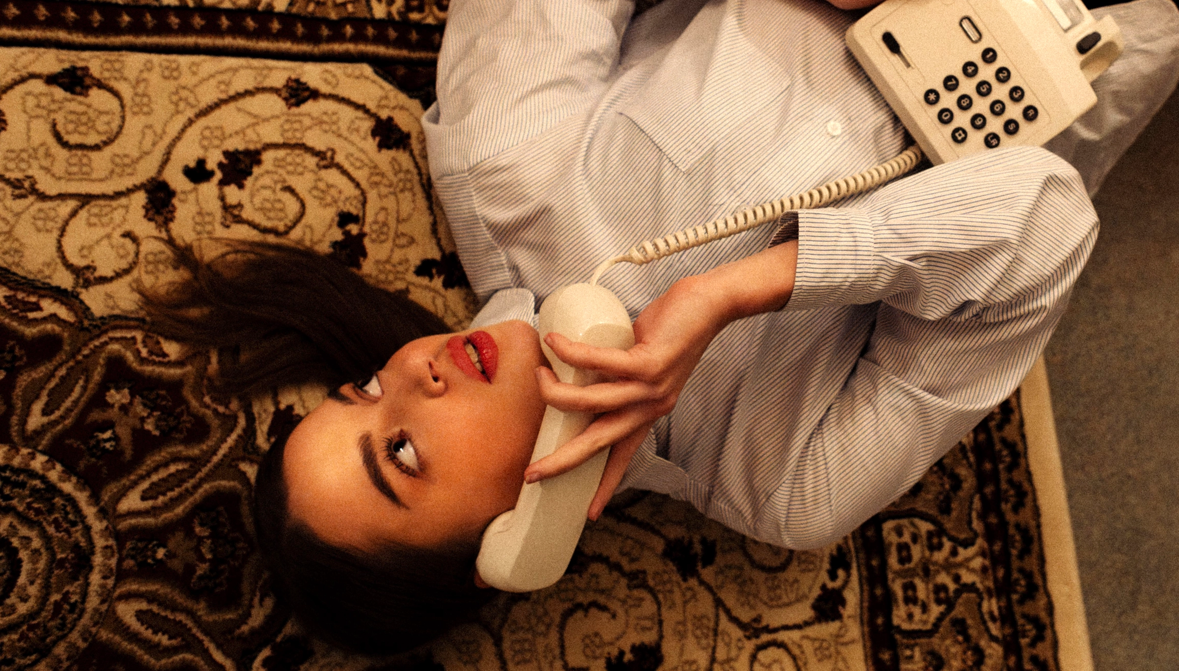
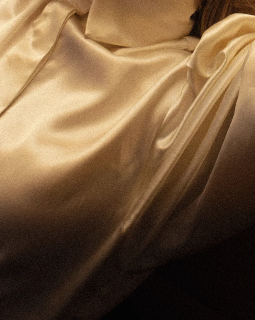
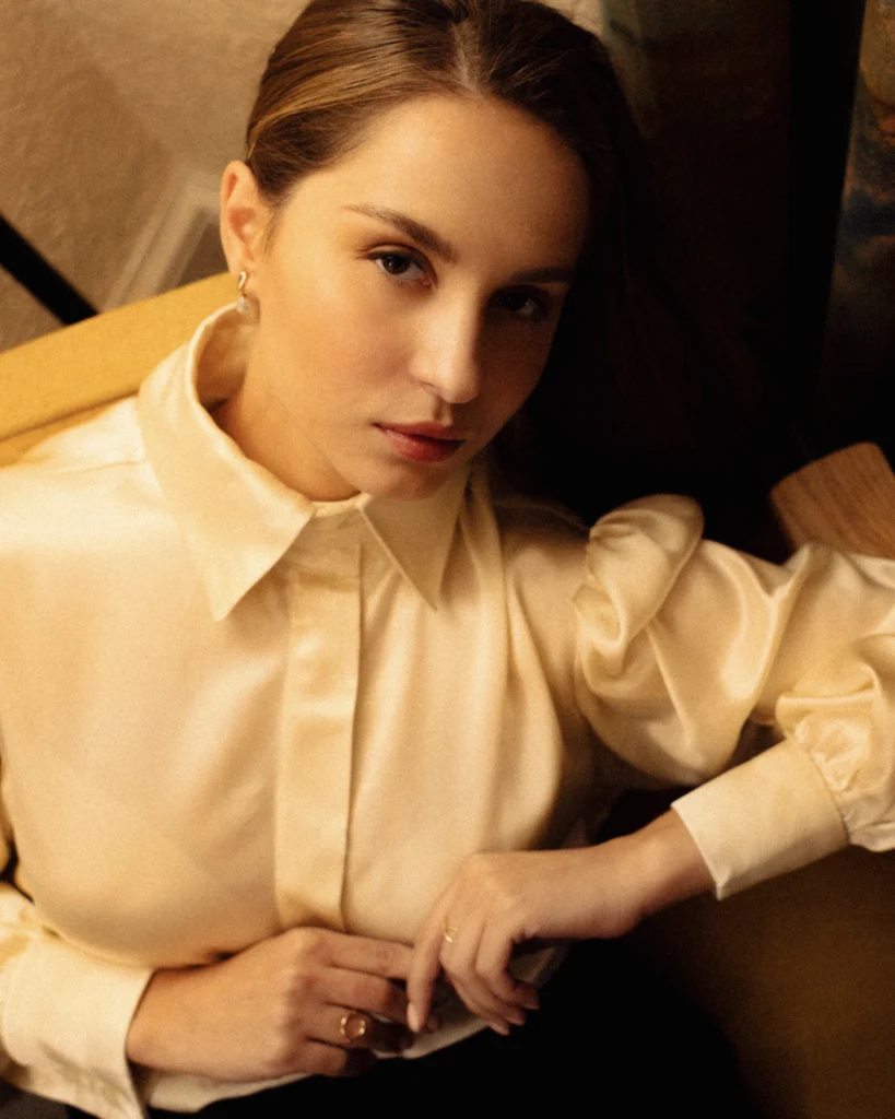
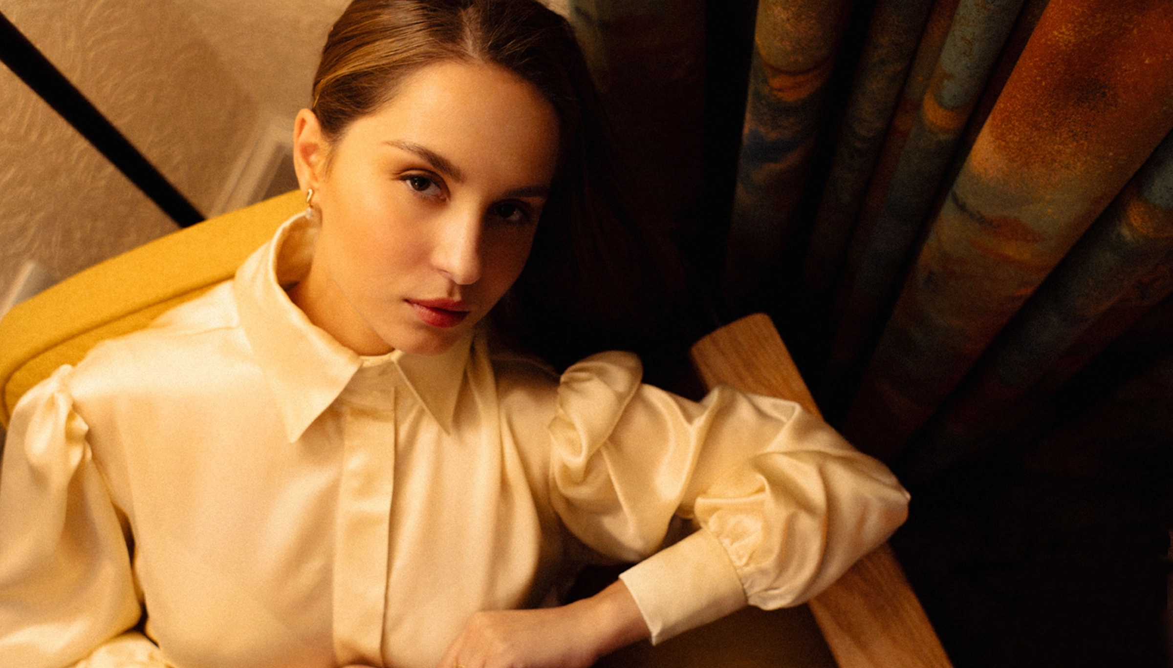
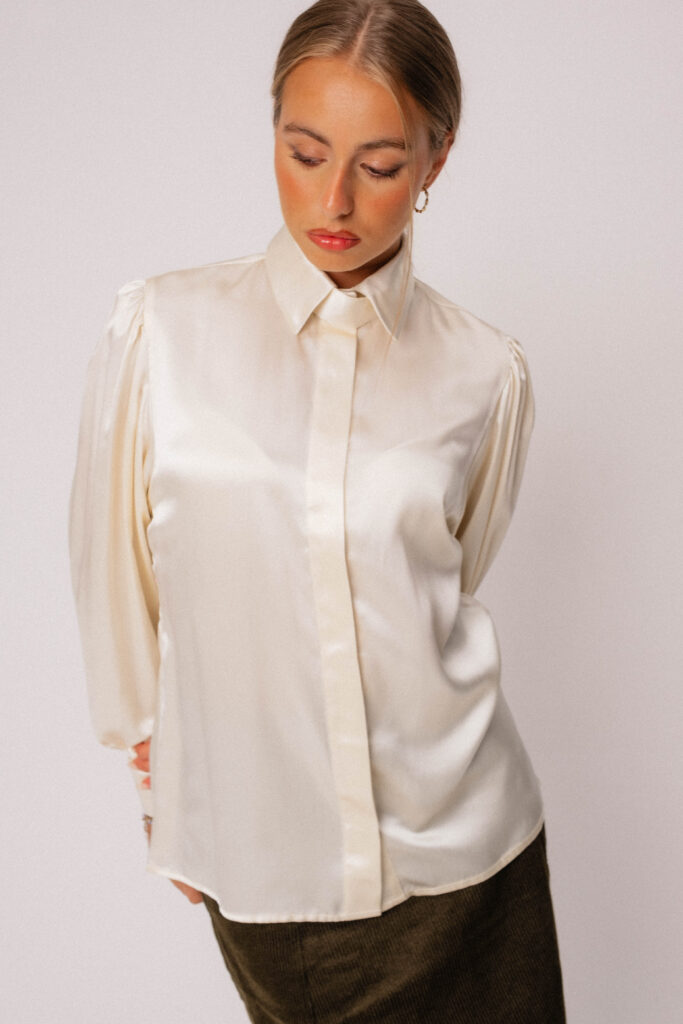
Designing the Visual Identity: British Nostalgia Meets Contemporary Editorial Luxury
Lutea’s design language came from a mood rooted in: 1980s and 1990s countryside British aesthetics. Many of which hold sentimental cues from early child life in england.
The quiet luxury of 90s British high fashion with editorial influences from the era’s Burberry, early Banana Republic, and Ralph Lauren. The challenge was to modernise nostalgia without feeling theatrical or costume-like or inherently re-interpreted.
So, Lutea’s identity blends:
- Clean editorial layouts
- Large-format photography
- Neutral, warm tonal palettes
- Magazine-style typography
- The serif logo set in Anth
The brand colour #b7893b became the anchor, a refined, golden-brown reminiscent of dry grass in late Somerset summer. The aim is not “retro luxury,” but something like: Modern countryside sophistication, designed with the clarity of contemporary fashion publishing. A glimpse of life known to many of the area which of course uses many cues seen in countryside chic photoshoots or interpretation but to create a cinematic version deeply real was the ultimate vision.
Editorial Storytelling as a Core Brand Medium
Lutea was never intended to be product-only. Instead, it behaves more like a story-led fashion house, an art project using:
Essays, lookbooks, poetic short films, campaign narratives, visual pacing and rhythm. Campaigns such as Our Impressionism, The Rhythm Endures and Not Your Heritage are built to expand the emotional world of the brand, not as marketing, but as creative works in their own right.
This approach is echoed in the website structure: Full-bleed lookbooks, Gallery-like collection pages, captioned editorial imagery, immersive loading animations with composed soundscapes.
This is where Lutea separates itself from typical independent fashion brands.
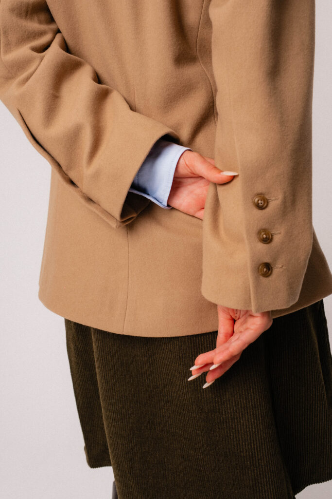
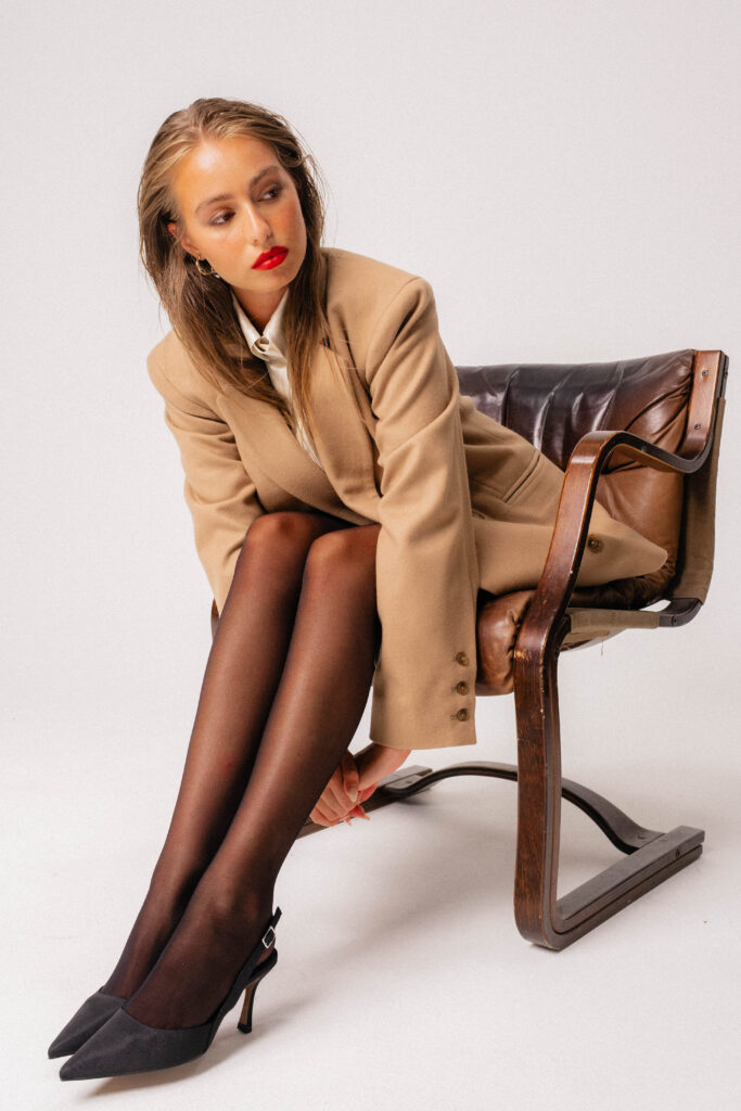
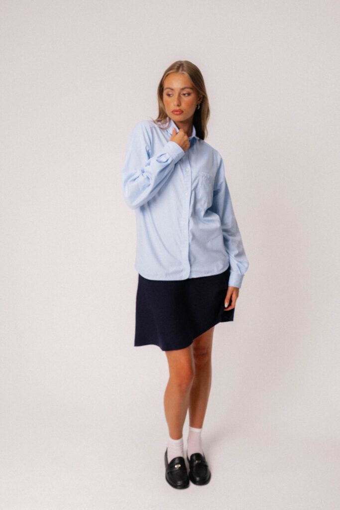
Product Design and the First Collection: Nineteen Eighty Seven
The first collection, Nineteen Eighty Seven, established the design tone:
- Tailored silhouettes
- Heavy coats
- Shirts with distinctive structure
- A material-first philosophy
- Clean finishes mixed with countryside utility
The collection isn’t about nostalgia, it reflects a reinterpretation of the era’s confidence and directness.
Each piece is:
- Designed at Lutea Cottage in Hallatrow
- Produced in small, sustainable runs in Somerset
- Named after local places, flowers, and regional references and sold with a lead time to ensure slow, careful production
Building the Lutea Website: A Fashion Experience First, a Shop Second
The website is designed the same way a magazine is laid out: Clean grids with controlled whitespace. Asymmetric editorial spreads leaning into full-page imagery and high-fashion typography with minimalist e-commerce UI inspired by LOEWE.
The goal:
To create one of the best-structured fashion e-commerce experiences online, not through complexity but through clarity, immersion, and storytelling.
Key design decisions:
WebP-only assets for speed
- Narrative-led product pages
- Lookbooks for each product
- Interactive gallery structures
- Mega menu inspired by LOEWE with category images
This creates a functional, high-fashion digital boutique without sacrificing usability, essential for a small luxury brand.
The Role of British Landscape and Lived Experience
Everything about Lutea returns to place. Somerset isn’t a theme,it’s the soil the brand grows from: The muted tones of farmland. The geometry of stone walls. The textures of rural labour. The nostalgia of countryside childhoods in the late 80s and early 90s.
Campaigns like Not Your Heritage highlight the tension between my authentic Somerset and the stylised heritage branding used by bigger companies & this contrast fuels the brand’s emotional tone.
Final Thoughts: Lutea as a Long-Term Creative Work
Lutea is designed to grow slowly, intentionally, and with longevity. It isn’t motivated by trend, mass marketing, or seasonal churn. Instead, the brand follows a philosophy of:
- Craft first
- Story first
- Humanity first
This is a long-term creative project, shaped by landscape, craft, and a desire to build something that feels genuinely British, contemporary, and emotionally resonant.
The result is a brand that stands not only as a fashion label, but as a body of work.